Colour, Curated
by The Ballito Writer · · 3 min read

Dark & Moody
Study
Base colour
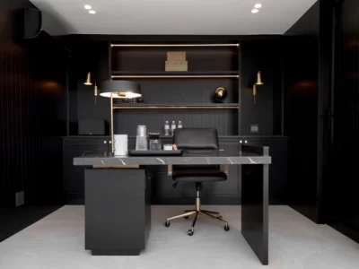
We chose a rich charcoal black as the foundation because it instantly creates depth, sophistication and a sense of calm. Rather than using black as an accent, we embraced it across the wall panelling, cabinetry and architectural details to blur boundaries and create a cocooning effect. This approach allows the room to feel intimate while giving every element a strong, sculptural presence.
Supporting tones
To give the palette a greater sense of depth and refinement, we layered warm brass finishes with richly veined black stone and dark timber. Integrated LED lighting gently washes the shelving, highlighting texture and creating visual depth, while matte and satin finishes catch the light differently, adding dimension without relying on additional colour. The result is a timeless, luxurious workspace where contrast comes from materiality, texture and light, proving that a restrained palette can have just as much personality as a colourful one.
Earthy & Grounded
Formal Lounge
(see opening image)
Base colour
For this living space, we chose a soft, warm white as the foundation to create a calm, light-filled interior that connects the rest of the home to nature. A neutral base allows natural materials and earthy tones to become the focal point without competing for attention. It also enhances the generous natural light, creating openness while maintaining warmth and comfort throughout the space.
Supporting tones
The palette is layered with warm oak, rich walnut, sandy beiges, caramel upholstery and chocolate accents to create depth and visual interest. Black joinery and furniture pieces provide contrast and anchor the scheme, while textured linens, woven rugs, handcrafted ceramics and natural timber introduce a tactile quality that makes the space feel lived-in and inviting. Rather than relying on bold colour, the personality of the room comes from the thoughtful layering of organic materials, subtle tonal variations and beautifully balanced textures. The result is an interior that feels timeless, grounded and deeply connected to its surroundings.
Colourful & Vibrant
Children’s Bedroom
Base colour
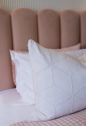
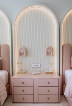
For this children’s bedroom, we selected a soft blush pink as the hero colour to create a space that feels playful, comforting and full of personality. Rather than using bright primary colours, we embraced a muted pastel that introduces colour in a sophisticated way while remaining timeless enough to grow with the space. Carrying the blush tone across the headboards, bedside cabinetry and feature lighting creates a cohesive foundation that feels calm rather than overwhelming.
Supporting tones
To balance the pink, we layered in crisp whites, warm neutrals and soft textures that allow the colour to shine without dominating the room. Fluted wall panels, gentle LED lighting and plush fabrics add depth, while natural timber, warm metallic accents and simple ceramics introduce warmth and refinement. The subtle gingham bedding adds another playful layer without competing with the overall palette. This tonal approach proves that vibrant interiors don’t always rely on bold contrasts; carefully layering varying shades of one colour with complementary neutrals creates a space that is joyful, elegant and beautifully considered.
Instagram: pop_design_studio
READ MORE

The Little Details
by The Ballito Writer · October 9, 2026

Fighting for More Than Titles
by Jacqueline Herbst · September 7, 2026

It’s About Feeling
by The Ballito Writer · August 21, 2026