The Art of Colour
by The Ballito Writer · October 10, 2025 · 3 min read

Inspired by shoreline hues and textured layers, this apartment showcases how thoughtful design can express harmonious balance and timeless beauty.
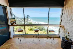
In a stunning Ballito apartment, Interior Edge applied the principles of colour theory to bring the space to life. Let's take a closer look at their design process. Their vision was to capture the essence of the ocean views, which guided their palette of soft neutrals, layered textures, and bold accent pieces. They drew inspiration from the soft blues and sandy neutrals of the coastline, introducing coral, earthy greens, and warm terracottas to reflect the vibrancy of the area. Each tone was chosen not just for its beauty but also for how it interacts with natural light at different times of the day.
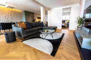
 To create a sense of flow and continuity throughout the apartment, they worked with a layered palette that carries through each room. Soft neutral colours provide a backdrop for bolder accents, such as the vibrant wallpaper in the living room, to stand out without overwhelming the space. By repeating textures like natural timber and stone colours, they established continuity from room to room while still allowing each space its own character.
Lighting plays a crucial role in enhancing the colour scheme. They layered natural light with soft sheers, concealed LED strips, pendants, and accent lights to bring out textures and finishes. For example, the timber slats in the bedroom are backlit to add depth and warmth, highlighting the natural materials. This layering ensures the colours feel alive and adaptive, from day to night.
They applied the 60-30-10 rule as a foundation: 60% neutral base, 30% secondary tones for balance, and 10% bold accents for energy. This ensured harmony without restricting creativity. They also worked with complementary contrasts - balancing warm terracottas with cooler blues - to create a lively yet grounded atmosphere.
 Colour is central to the emotional story of each space. In the living area, bold and expressive tones spark energy and conversation. In the bedroom, softer hues and layered lighting create a calming retreat, while playful touches add personality. Their aim was to evoke a balance of tranquillity and vibrancy - a home that feels both restful and uplifting.
Neutral tones served as a grounding backdrop, allowing them to introduce bold colours strategically. They paired strong feature elements, like the mural wall, with understated finishes - oak flooring, textured fabrics, and muted cabinetry - so the eye is naturally drawn to focal points without feeling overwhelmed.
Their palette responds beautifully to changing light. During the day, natural light enhances the soft neutrals and ocean-inspired hues, while in the evening, layered lighting warms up the space, making it feel cosy and intimate. This adaptability ensures the apartment feels timeless across seasons.
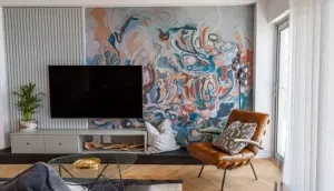 To bring the colour scheme to life and create a cohesive look, they added final touches, including handpicked fabrics - patterned cushions, woven baskets, and textured throws - that tie the palette together. Art and accessories were carefully selected to complement the wallpaper's energy without competing with it. These accents unify the scheme, making the space feel complete, personal, and cohesive.
By applying key principles and techniques, they crafted a space that not only reflects its stunning ocean views but also evokes a sense of tranquillity and vibrancy. Whether you're looking to revamp your own home or simply appreciate the art of colour, this feature is sure to spark your imagination and inspire you to craft a truly exceptional environment.
Instagram: @interior__edge
Photo Credit: Gareth Bargate Words by: Elvida Sydney
READ MORE
Ballito Life by Arcis Reaches Completion delivering Ballito’s first Aparthotel Offering
by Rainmaker Marketing · June 17, 2026

Relaxed Luxury & the Coast
by The Ballito Writer · June 5, 2026

Lessons from My Father - Cobus Oelofse
by The Ballito Writer · June 4, 2026